Sunday, April 28, 2019

Abby Brewer 2019


Young Master's Art Show 2019

"Crazy Zailey"


Here is one of my art pieces that I submitted into the Young Master's Art Show this year. It got an honorable mention and is a graphite drawing of my dog Zailey. What inspired me to draw her was because I love animals, especially dogs. My family and I adopted her from a close friend, who couldn't take care of her anymore. A week after we got her, I was sitting in my living room and she jump onto my lap. Which was the perfect opportunity to snap a few pictures of her. Out of all the pictures that I took I chose this one.It took me awhile, because the hardest parts were the eye, correct placement of the nose, and the fur texture. Overall, this would have to be my favorite piece and I really like how it turned out. Love you crazy Zailey!!


"Garden Feast"

The second piece that I submitted to the Young Master's Art Show was a photography piece of a grasshopper. It was after school, when I went to pick some tomatoes out of the garden. While I was doing this, I stepped on an unwanted pile of weeds, that was on the side of the tomato plant. That second, a flash of something small had jumped into the grass. I slowly approached it and realized it was a grasshopper sitting on a strip of grass. I quickly took my phone out of my coat pocket and zoomed in on the camera to make the background blurry. Guess he just wanted to say hello and then he jumped away.
"Never Summer Mountains"

The last piece that I entered into the Young Master's Art Show was a photography piece of trees and mountains in Estes Park. My dad was driving on Trail Ridge Road, but I asked him to please pull over so I could take pictures. Even though, it was very foggy, I sat on the edge of a large rock and waited until the fog cleared up. Next thing I knew, green specks were peeping through the fog. The sky wasn't completely clear yet, but I decided to take pictures anyway because it was so beautiful!

Commission Piece for Staff Member


           "Large Thumbnail Sketch"                                                                                             "Small Thumbnail Sketches"

I had to choose either a staff member at school or a teacher and create a piece of artwork for them. It was a very hard decision, because I love all my teachers, but Mr. Davis who is my history teacher. I asked him and Parent Teacher Conferences if he wanted to be the person receiving a piece of my artwork and he said yes, I would love that! During Panther Times, I asked him a few questions and drew small thumbnail sketches to get a general idea of what he wanted once I got all of the details I took all of that information and put it into my art piece. He wanted the gorilla to be cool colors and the leaves warm colors with water color. When I first started, I used a large canvas which was a huge mistake, because the water colored pencils wouldn't stay in place because of the shiny surface. I then decided to use a medium piece of water colored paper and that worked much better. 


Since my teacher said he liked sloths and gorillas, my first few sketches were of those two animals. We came to an agreement and he said that I could do a gorilla instead of a sloth. I drew them in different positions, such as hanging in a hammock and sitting in a chair. For the background I lightly sketched out leaves behind him and filled them in with watercolor. They were light violet with a tint of bright yellow. Since I'm not used to using watercolors, it was a challenge for me but I liked the final results and so did Mr. Davis.


"Green Gorilla"

With a lot of time and hard work, this is my final art piece for Mr. Davis' gorilla. I used a medium sized watercolor paper with water colored pencils for the leaves. When I finished I presented it to Mr. Davis and he said it is cool and awesome! He couldn't wait to hang it up in his classroom. 

Gallery Visits


"RINO Crush Walls"

During first semester, our P.A.H group took an art field trip to the RINO Crush Walls. It is located near downtown Denver and the streets are filled with painted work. Each artist gets to choose an alley way to paint, but before they do they have to get permission by the person who owns the building. Once they get permission, they are free to spray paint what they want. Some looked like they had sentimental value while others looked like they were done for fun. My friend took this picture of me when we were on the trip. The reason why I chose this one was because it is literal and figurative, with the rhino holding an orange crush can. Another thing I really liked about this spray paint picture was the blue writing and how it contrasted with the rhino.


Mr. O'Connell arranged for the visual arts students to take a tour of the "Doodle for Google Building" in Boulder. When we reached our destination, there were two large buildings that were a part of the Google building. When we entered the building our tour guides met us and showed us through the buildings. Throughout the building different areas were made to be like different scenes in Colorado. Such as a camp ground, with a small pop up trailer. Then we all gathered in a conference room and they explained to us about the "Doodle for Google" contests they have each year. When we got back to school, Mr. O'Connell gave us   an assignment for creating a Doodle for Google. It was a fun and very educational experience.


I was pleased and honored that Mr. O'Connell submitted a piece of my art, into the Jefferson County High School Art Show this year. Out of 870 entries, only 480 were chosen to be displayed and I feel honored to be among those 480. It was a lot of fun to go and visit the Arvada Center, to view my art and all of the other art pieces in the show. My two favorite pieces, besides my own that were in the show would have to be, "Wolf Got Your Tongue" by: Becky Young and "Fright" by: Alexander Fitzgerald. There were so many beautiful pieces of artwork in the gallery and it was hard to choose, but these two caught my eye. The drawing of the wolf and the person caught my eye because it was created with graphite which is my favorite tool to draw with. When I looked at it, it made me feel calm and happy because the wolf was licking its owners face to show love and affection, just like our pets do. The second piece that really caught my eye was the photography piece of a little girl looking underneath a bed. The reason why I liked this one was because, even though the title name was called "Fright" when I looked at it I felt curious. Many questions went through my mind such as, "Is she actually scared?" "Is there something scary under her bed, or is he just scared because she thinks something is under her bed when there really isn't?" These are the types of things I was thinking while viewing this photography piece. I enjoyed everything and it was an amazing experience!!


"Wolf Got Your Tongue" by: Becky Young


"Fright" by: Alexander Fitzgerald


"Jeffco High School Art Show 2019"

- If you'd like to know more about my art, follow me on my art account on Instagram 
Username: passion.4_art


Grades:
Sem 1 (fall)- Creative Art-Drawing A
Sem 2 (spring)- Creative Art-Drawing Int A


Monday, April 30, 2018

D'Naya stone May 2018

Gallery vist 1: Rino distrect
This exhibit was so full of color and so full of life that you could really tell that the artist put a lot of effort into what they were painting. Every single piece that you saw you could tell it had a special meaning to the artist. One of my favorites was a set of heart wings made by, Kelsey Montague. This piece was called #whatunitesus. I like this piece a lot because it was really interactive, you got to involve yourself in the piece and it made you feel like a part of it. This piece influenced my art because, in the future I want to try making my art interactive. I want it to be something that everybody can play around on.

Gallery vist 2: Arvada center(chair exhibit)
This exhibit was so creative that as soon as you walked in you immediately wanted to smile.  Some chairs were silly and colorful and then some chairs were more serious, but what I really liked about this exhibit was that almost every chair was the same style but every single artist made it their own. I really enjoyed looking at the chair made by Don Quade. This chair looked like it was pulled straight from a fairy garden. It was so colorful yet simple at the same time and you could tell that the artist paid really close attention to detail. This influenced me to start paying more attention to the detail I put into my art. Make my art something I’m proud of.

Gallery vist 3: Denver Art Museum
This exhibit had so many different kinds of art that when you looked around you could definitely find something that you liked. You could spend hours in there looking at every single piece of art and trying to figure out what it means. There's so much color and inspiration and a lot of the pieces you have to stop and think about the meaning behind the art. One piece in particular, as soon as I entered the room I went straight to it. This piece was made by Duke Beardsley and one is called Burnin’ Rubber and one is called Against The Bit. This piece really spoke to me because of the colors and the contrast that he created with in the 2 paintings. My eyes were immediately drawn to the rope around the horses necks. The one on the left is bright but a little more crazy and the one on the rights is darker and more simple. This piece was one I stopped and stared at and honestly I really couldn't find a meaning out of it but the way it was painted was so beautifully done that you knew there was a story behind it. That's really something I want to include in my own art I want to make sure that there is a story behind it and that instead of me telling the story you can look at the art and know the story or even come up with the story of your own.

Young Masters art show
I got two pieces accepted into the young masters art show. One was a ceramic piece and one was a photograph. My ceramic piece is called Beauty in decay. My photography peace was called growing through the pain.


Collaboration
My collaboration piece this year is a work in progress.  I am working with Zoe to create a marbled painted Bowl. We got our inspiration from the picture on the left and the picture on the right is our project now. Along with the bowl, we are also making a clay pendant that will have the same matching paint as the bowl. I am building the bowl and the pendant and then Zoe will be adding the paint.


Website:
https://dnaya2001.wixsite.com/mysite

Grades:
Advanced 3D art (sem.1 Fall) : A

Advanced 3D art (sem.2 Spring): A


Friday, April 29, 2016

Xander Low 15'-16' Letter

Gallery Visit 1: Light Rail Art Gallery


Ed Fiske is a photographer featured in the Light Rail art gallery in Old Town Arvada. I liked the depth of field in his work, and the way he captures the space in his work. Even though I'm a painter for the most part I was really inspired by the way he captured space and the full depth of field he uses, and the color he captures. Lately I've been inspired to do landscapes, and his worked inspired me to really push for the realistic use of space and color in my work. .


Gallery Visit 2: Young Masters
Julia Smith
(from Julia Smith's AP Website, http://juliasmithsarts.weebly.com/drawing.html) 
I was really impressed by my peers work this year, there was a lot of strong pieces this year. One in particular was a colred pencil portrait of a horse by Julia Smith. The way she utilized the space, as well as the negative space of the black background really made the piece pop. It inspired me to push myself harder with prismacolor, to achieve more intense colors and a high emotional impact whilst remaining technically strong in my work.


Gallery Visit 3: Jeffco Art Show

Gracie Branaugh, Jefferson County Gallery
      Recently I went to the Jefferson County Art show at the Arvada Center. I was amazed at the work I saw. The gallery set up encouraged the viewer to wander further in, and the gallery felt incredibly professional. The piece of work that stood out to me was by an artist named Gracie Branaugh and it was the hand drawing above. The movement and concept of the veins being a tree to me was incredibly clever and created a lot of visual interest. This piece will influence my work to incorporate new ideas and interpretations of interesting pairs. I may also want to try graphite, as there were many graphite pieces in the show in general that really inspired me.

FALL SEMESTER: AP Drawing Studio-A
SPRING SEMESTER: AP Drawing Studio-A, Advanced Drawing- A

Collaboration Project: Line Art Swap and Color with Jordan Marius Wright
We each gave each other prompts and drew what the other person wanted. Than we took the line art we drew for each other (example, Jordan asked for a forest scene so I drew him a forest scene in which he then colored the work I did for him.)
Here is the timelapse of me coloring in the collaboration of the line art Jordan Wright made for me.

YOUNG MASTERS ENTRIES:
(picture taken from PAH Facebook page)
Broken Bluebirds


The Inner Mind

ONLINE ART PRESENCE: 
BlewBirdArt, also I go by Xander Blew on my online art.
Here's my AP website: http://blewbirdart.weebly.com/
I update my work on my website frequently. 
This is my latest time lapse video of a piece from my concentration called Dreams.
This is my YouTube channel:


Tuesday, March 22, 2016

Katie Powell '15-'16 Letter

        Gallery Visit 1:  Arvada Center; Art of the State
This exhibit was a lot of fun! There were so many piece's that made me think and even question how art is seen throughout our community. One of my favorite piece's was a sculpture that was made of rice puff cereal and clothing. It was really life like silhouette (minus actual human detail). This really makes me want to try realism and play around with other art medias that might not seem like they could be used for art, like cereal.

Gallery Visit 2: Denver Art Museum
This museum was full different floors that were filled of different cultures, I personally liked the Japanese floor. I want to try making brush strokes that look feather-y in my own paintings.
  I also really liked the Victorian floor. This painting really grabbed my attention because of the realism aspect and how it doesn't even look like a painting. I want to try more realism in my own art.
Gallery Visit 3: Out Door Gallery
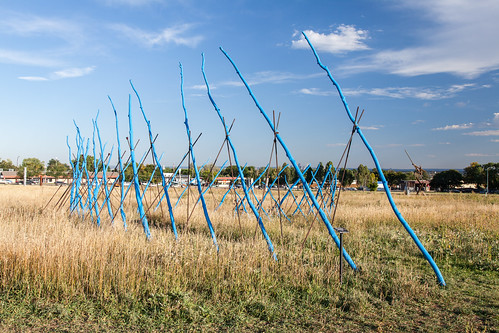
I visited the outdoor galley by the Arvada Center. Most of the pieces's were more modern, which is a really confusing style of art to me, but the sculptures were amazing to look at! I admired this particular sculpture that was of a bunch of blue sticks. I want to try using movement into my art, like this piece does.Your eye
moves along with it.


FALL SEMESTER: Begging Graphic Design (A)
SPRING SEMESTER: Intermediate and Advanced Drawing (A)

Commission Project: Painting of Pomona Panther that is in Milly's (Mrs.Mills) office. And is the Choir T-shirt Design.


Commission for my father's friend
Self-portrait of his father.

Young Masters Show entries: 
Colored pencil drawing of Robot Girl 


Online presence: Deviant Art--kkluvsart 
http://kkluvsart.deviantart.com/

Tuesday, May 19, 2015

Raelynn Rodriguez Letter '15

                           Gallery Visit 1: Arvada Center 44th Annual Jeffco Art Exhibition
This exhibit was so much fun to experience because of all the talent that can be showcased from Jefferson County. My favorite one from the show is Gatsbey Dinneware by Marcus Nortan. This really takes my back to the party scenes in the movie/book/play and it looks all even and light. This inspires me to try to make sets and to better my wheel throwing skills.


                              Gallery Visit 2: Westminster People's Fair 2015
This was a unique small gallery that displays many great art from unknown people. My favorite one would be this 2D picture of the flowers and unique texture. This influenced me to try making more nature themed art and to play with different mediums to make a multi-media piece.


Gallery Visit 3: Pomona Young Masters Art Show 2015
This is one of my favorite galleries because of all the art that is displayed is people from our own school! My favorite are piece is Tusk by Julia Smith. This influenced me to be more detailed oriented with my hand building work. Also the raku glaze also gave me ideas on how to include the black "negative space" as Julia did for the tusks. 


Fall Semester Class: Ceramics Intermediate
Spring Semester Class: Ceramics Advanced 

Commissioned Project: Acrylic and Watercolor painting of the skyline of Paris for Madame Fuller. (Individual piece and picture will not upload, displayed in her classroom)

Website: http://raelynnsart2.weebly.com/
Instagram: raelynns_art

Young Masters Art Show Entries: Ancient Bamboo (displayed in front office) 
Geometric Pot (displayed in the Pomona Gallery: no longer on display)

Thursday, May 14, 2015

lettering:Chanel Villia

Hi I'm Chanel Villia♥!!
 I went to the outdoor exhibit at the arvada center and with this particular peice i found to be my favorite. It has suck great movement that the shining and shadows on it make it pop along all the others. It will influence my are for more whimsy and curves. It's taken geometric shapes and made them organic which I love.
Displaying FullSizeRender.jpgNow for this one I'm sorry about the quality I was trying to be sneaky. But this was at the Art Museum and it was a video of people in "hair" suits and they were dancing around and jumping. This inspires me to step outside the box. It was set up in a room where you could put pieces together and create something new and I think being around creative things with just give me more inspiration, I don't remember the name of the gallery but it was at the beginning of this year
Displaying IMG_7761.JPGDisplaying IMG_7763.JPGThese  were from the Pomona gallery. In the first picture The realism is great and the highlights being so extreme make alowed me to take some risks with my drawings this year and the 2nd picture shows two contradictory things to make a statement. I also like that it was in a white background for more emphasis on the picture.

This year I was in Intermediate Jewelry and Beginning Drawing

 Displaying IMG_7396.JPGThis was my commission piece. It was purchased by Mr. Guise

https://www.tumblr.com/blog/chanelsart This is where I put the art I have done this year and last year. It also has something i find inspiration in.

I entered two pieces into the Pomona Young Master Art Show this year

This is my Collab piece i did with Rae. She taught me how to make a pot and she came up with the belly shape. I wanted a tree on it and we compromised on the size. I wanted it small she wanted it big, so we met in the middle. Rae carved the tree and I really like the texture on the inside because it gives the piece more character. It was a lot of fun to make with her and i learned how to compromise on a piece to make everyone's ideas complete.

Monday, April 13, 2015

Isaiah Wortham Letter '15

DeviantArt: http://isaiahw14.deviantart.com/

Young Masters Art Show Submission


Visit #1: Young Masters Art Show.  My favorite piece was "Hollow Earth" by Justin C'Debaca.  I like the technique he used in his blending.  It gave the gave the piece a realistic rendering of water, trees, and mountains.  He used his composition space well.  The color scheme was both warm and cool, as shown in the blue and white water and the red leaves on the trees.

Visit #2: RMCAD special gallery.  A piece I found interesting was "Gold, Hookers, and Sociopolitical Justice" by Arlexis Gallegos.  The piece took up a small room with a composition on three walls.  Each wall had one of the themes: gold, hookers, or sociopolitical justice.  The illustrated portion had several contour drawings overlapping each other.  In front of each drawing hanging on the wall were several trinkets that had to do with the topic.  They were all colored solid.   I enjoy the composition and the unique approach at depicting their topic.


Visit#3: RMCAD alumni gallery.  A RMCAD alumni, E.G., created an un-named, but interesting piece.  It depicts a young girl wearing kaleidoscope sunglasses with a ruby headband and several tattoos holding a three-eyed cat.  The background is a forest-like environment with birds, snails, and a rainbow.  I like this piece mainly for its originality.


Collab with Justin C'Debaca:
Graphic novel: "Out of the Rabbit Hole"


Creative Art 2D Studio       B
Creative Arr 3D Studio       B
Creative Art Beg. Drawing B
Creative Art Inter Drawing B
Creative Art Adv Drawing A